Interpreting the Inclusive Practices reports
Interpreting the School at a Glance reports
Interpreting the Items at a Glance reports
Comparing Inclusive Practices reports over time
Interpreting using more than one source of data
Read more about themes and sub-concepts explored with the IPT
Interpreting the School at a Glance reports


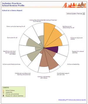
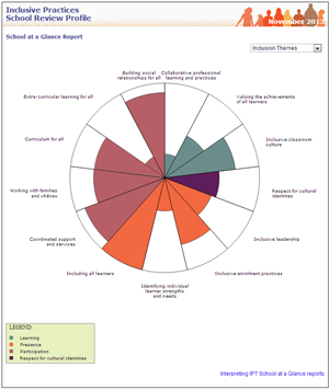
The circular School at a Glance reports represent each school as a system with different dimensions (called themes and sub-concepts). The reports give a visual overview of different aspects of inclusive practice at a school. The reports can be used as a starting point to look for patterns or differences that can then be explored more fully in the Items at a Glance reports. Some examples of how you might interpret the School at a Glance reports are:
To identify possible strengths
Look at the overall patterns in both reports.
Are there any themes or sub-concepts for which most of the sector is coloured in?
If the Items at a Glance reports from staff, community members or students also show a high level of agreement that the practices in this theme or sub-concept are in place, this could indicate a strength at your school.
To identify possible next steps
Look at the overall patterns in the reports. Are there any themes or sub-concepts for which there appears to be a lower level of agreement? (That is, less of the sector is coloured in). This may indicate that further exploration is warranted in the more detailed Items at a Glance reports from the Staff, Community, and Student Surveys. These reports may suggest practices that could be further built by focusing on them in your action plan.
Read more about using the Inclusive Practices data to develop an action plan
Interpreting the Items at a Glance reports
(student, staff, and community reports)

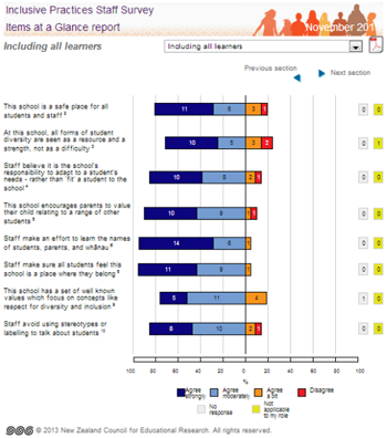
The Items at a Glance reports show how people responded to the survey items ordered by the themes of Presence, Participation, and Learning. The staff report also shows the items ordered by the sub-concepts within each theme.
All Items at a Glance reports show how people responded to each survey item based on the raw survey data. Each report displays a group of survey items on the left hand side of the page. Next to each item is a strip graph showing the proportion of staff, community members, or students who chose each of Agree strongly (For students: Agree heaps), Agree moderately (For students: Agree a lot), Agree a bit, and Disagree.
A percentage scale is provided at the bottom of the graph. The numbers on each strip show the count of how many people responded to each agreement category. A dividing line down the middle of the report is used to help identify the overall level of agreement or disagreement with an item.
If fewer than 5 people respond, the graphs cannot be displayed for confidentiality reasons.
The last question of each survey asks people if they have any extra comments they would like to add. The final page of each Items at a Glance report displays these comments.
We suggest you go back to each Items at a Glance report after the School Review Profile (School at a Glance) reports have been studied. The Items at a Glance reports offer a more detailed analysis of any areas of interest and will provide the ability to broadly compare some responses from staff, community members and students.
Using Items at a glance reports to look for areas of strength and next steps
Identifying possible strengths
Look at the overall patterns in the reports. If the Items at a Glance reports from staff, community members or students show a high level of agreement that the practices in this theme or sub-concept are in place, this could indicate a strength at your school.
Identifying possible next steps or areas to build practice
Look at the overall patterns in the reports. Are there any themes, sub-concepts, or particular items for which there appears to be a lower level of agreement overall, or by particular groups? This may indicate that further exploration of this area is warranted. These sub-concepts, or the particular practices that are described in a survey item, may become a focus in your action plan. (Note that most items are worded positively. A few items in the Staff and Community survey are reversed. This is shown by an “R” at the end of the item.)
Identifying similarities and differences between staff, community members and students
The data in the Items at a Glance reports can be compared to look for overall patterns and differences between groups. The questions in each of the surveys are closely related. The Staff Survey is a reduced set of the SRP questions, and all items in the Community and Student Surveys are parallel versions of an item in the SRP. In the Community and Student Surveys items are written in language appropriate for their audience.
Each item in the Items at a Glance reports for the Staff, Community, and Student Surveys include an extra item number which shows how this item maps onto its equivalent SRP question.
To compare staff, community and student perspectives, look for items where views appear to be substantially different. One way to do this is to look at the 5 items for which staff, community members, and students showed the lowest level of agreement. Is a similar pattern evident across groups, or does this data show differences in perspectives? Look at the comments report – do any of these comments offer information that assists in interpreting the survey findings?
When selecting these 5 items, note that most are worded positively. A few items in the Staff and Community survey are reversed. This is shown by an “R” at the end of the item. You would expect that more people will disagree with these items.
A large difference between staff, community or student views may indicate that further investigation and discussions could be useful. It can be common for school staff to show more agreement that practices are in place in comparison with community members or students. These sorts of findings can unsettling people, but they also provide a starting point to learn more about your community. It is important not to ignore or try to “explain away” these differences, as these may indicate aspects of school practice that could be included in an action plan. We suggest you discuss these differences with small groups of students, parents, whānau and caregivers, or staff, and ask for their suggestions about ways to improve practices.
Read more about using the Inclusive Practices data to develop an action plan
Some things to consider when comparing the Items at a Glance reports
When making comparisons it will be important to bear in mind the number of people who have responded to the surveys. When the numbers represented in the graphs are small (fewer than about 30) a large percentage difference between groups may equate to only a few people. Therefore this difference may not be meaningful.
For students, comparing across year levels needs care. Students in Years 9 and 10 are less positive on average than students in Years 5–8. In other words a drop in the level of agreement between year groups may be due to a national trend, rather than something attributable to your school in particular.
Students from different cultural backgrounds tend to respond differently to survey questions. For example, Pasifika students tend to respond more positively overall. Consider how the mix of students at your school might influence your student data.
Comparing Inclusive Practices reports over time
Repeating the Inclusive Practices tools can support you to review the extent to which the activities in your action plan are making a difference. This review is likely to result in new goals and a revised action plan.
You may want to use Inclusive Practices data to look for a global shift towards your goals, or to assist you to evaluate whether particular activities in your action plan have made a difference.
It is important to be aware that change in schools takes time. You might expect to see small shifts after 1-2 years, and more obvious patterns after 3-5 years.
Looking for global shifts over time
Surveys can be useful tools to explore global shifts over time. Look for differences in themes and sub-concepts, as well as differences in groups of items.
Look at the overall patterns in the School at a Glance reports. Are there any themes or sub-concepts for which patterns of responses have changed over time?
When you first used the Inclusive Practices Tools:
- which were the themes or sub-concepts for which most of the sector was coloured in? (That is, there was a higher level of agreement that these practices were in place)
- were there any themes or sub-concepts for which less of the sector was coloured in? (That is, there was a lower level of agreement that these practices are in place).
Look at your current results to see if the patterns in your data are similar or different:
- Are there now some themes or sub-concepts that appear to have more of the sector coloured in than before? This may suggest that these practices have become more embedded in your school.
- Are there now some themes or sub-concepts that appear to have less of the sector coloured in than other areas? This may suggest that these areas could become a new priority for your action plan.
Now look at the Items at a Glance reports from the from the Staff, Community and Student Surveys to see if there has been a change in groups of items, or particular items.
Look at the 5 items for which staff, community members, and students showed the lowest level of agreement when you first used the Inclusive Practices surveys. Has there been any change in the position of these items? Look at the items for which different groups seemed to have different perspectives. Is this still the same, or have the groups become more similar over time? Look at the comments reports – what do these now tell you about your school areas of strength or concern?
Looking for changes relating to activities in your action plan
To evaluate whether particular activities in your action plan appear to be making a difference, select the Inclusive Practices sub-concepts or survey items that are most strongly connected to these activities and look at these to see if there has been a shift over time.
Evaluating shifts over time
Deciding when a change in the proportion of people agreeing with a survey item is more than just a random fluctuation needs to be approached with care. When making comparisons over time it is important to bear in mind the number of people who have responded to the surveys.
If more than about 80-90 people have completed each survey, as a rule of thumb, a 10% shift from one category to another (e.g., Disagree to Agree a bit) will generally be sufficient to indicate that the change is more than a random fluctuation.
When the numbers represented in the graphs are smaller (i.e., fewer than about 30 people) a large percentage difference between groups may equate to only a few people. In this case, a shift of more than 15-20% from one category to another (e.g., Disagree to Agree a bit) will indicate a change that is more than a random fluctuation.
When there is a general change in the same direction across many items in a sub-concept you can become more sure the difference indicates real (non-random) change even if the percentage changes for each item are less than 10-15%.
Overall, it is important to be cautious about making statements about change. You need to consider whether the changes you see are meaningful or important in the context of your school.
Interpreting using more than one source of data
Collecting more than one source of data can give you a stronger sense that changes you see in the Inclusive Practices data show the activities in your action plan are making a difference. As you repeat the Inclusive Practices process, this is a good time to hold feedback sessions with the students, staff, and parents, whānau and caregivers who have been most involved with activities in your action plan. This information will assist you to understand the patterns you see in the survey data.
When you developed your action plan you may have also specified other sources of data that could give you some information about whether the activities you planned would make a difference. What does this information show you?
If the data and feedback you get from different sources show a similar picture about the effectiveness of the activities in your action plan, then you can be more assured that these activities are making a difference.
